
If your Divi 5 Landing Pages are getting traffic but not conversions, the problem is rarely the ads or the audience. It's the page itself — how it's structured, what it communicates, and which tools you're using to build it.
Divi 5 gives you an incredibly flexible visual building experience. But flexibility alone doesn't convert visitors into customers. That requires intentional design, the right modules, and a conversion-first mindset.
This is a complete, practical guide to building Divi 5 Landing Pages that go beyond looking good — the definitive resource for anyone serious about converting visitors with Divi 5 Landing Pages — pages that generate leads, drive sales, and deliver measurable results. Every module mentioned here is real, verified, and available in Divi Essential v5.6.1 — the #1 module pack for Divi 5 with 105+ modules and 22+ extensions.
What Are Divi 5 Landing Pages?
Divi 5 Landing Pages are standalone, goal-focused pages built inside the Divi 5 Visual Builder. Unlike general website pages, Divi 5 Landing Pages are engineered to drive a single action — whether that's purchasing a product, signing up for a course, booking a consultation, or downloading a lead magnet.
The core principle of great Divi 5 Landing Pages: remove everything that doesn't move the visitor closer to converting. No global navigation. No unrelated content. No distractions. Just a focused, guided experience from headline to action.
What makes Divi 5 Landing Pages particularly powerful in 2025 is the combination of Divi 5's real-time visual builder with the extended capabilities of Divi Essential's module library. Together, they let you create experiences that static pages simply cannot deliver.
Why Most Divi 5 Landing Pages Don't Convert

Before building better Divi 5 Landing Pages, it's worth understanding exactly why most of them underperform:
Weak or missing CTA hierarchy. Many pages have a CTA somewhere, but it's not prominent, repeated, or contextually reinforced throughout the page. Visitors reach the bottom and have already lost momentum.
No emotional engagement. Feature lists without benefit framing, walls of text without visual rhythm, and hero sections without motion all lead to the same result — the visitor leaves without feeling anything.
Static, non-interactive experiences. Research consistently shows that interactive content drives significantly higher engagement and conversion. A page that responds to a user's hover or click creates a fundamentally different psychological experience than one that doesn't.
Missing trust signals. First-time visitors are skeptical by default. Without testimonials, reviews, comparison data, or social proof, there's no mechanism to reduce that skepticism before asking for action.
Poor mobile experience. More than half of landing page traffic is now on mobile. Pages built without mobile-first thinking — tight spacing, large tap targets, fast-loading assets — leak conversions at every scroll.
Wrong tool for the job. Using only Divi's native modules when purpose-built conversion modules exist means leaving serious performance on the table.
The Anatomy of a High-Converting Divi 5 Landing Page

Every effective Divi 5 Landing Page is built on the same proven framework. Whether you're building Divi 5 Landing Pages for SaaS, eCommerce, or services, this structure applies: a logical conversion architecture. Here's the framework:
1. Hero Section
The first five seconds determine whether a visitor stays or leaves. Your hero needs a bold, outcome-focused headline, a compelling sub-headline, a primary CTA, and a visual element that supports the message. Animation dramatically increases time-on-page in hero sections.
2. Problem and Solution Block
Before presenting features, acknowledge the visitor's pain point. When people feel understood, they're significantly more receptive to your solution.
3. Benefits and Feature Breakdown
Translate features into outcomes. Don't say "Advanced Tab Module" — say "Organize complex information without overwhelming your visitors." Scannable icons, short copy, and clear outcomes drive comprehension.
4. Interactive Proof and Discovery
Hotspots, before/after comparisons, and interactive sliders let visitors explore your product on their own terms. This kind of self-directed discovery creates stronger buying intent than passive reading.
5. Social Proof
Testimonials, star ratings, case study snippets, and client logos all serve one purpose: reducing doubt. Place these immediately before and after your primary CTA sections.
6. Primary and Secondary CTAs
Your main CTA belongs above the fold, repeated in the middle of the page, and once more near the footer. Each CTA placement serves a different visitor — the ready buyer, the curious browser, and the convinced-but-hesitant reader.
7. FAQ Section
Directly addresses objections before they prevent conversion. An FAQ section functions as a silent sales conversation.
Step-by-Step: Building Divi 5 Landing Pages
Step 1: Define a Single Conversion Goal
Before opening the Divi 5 Visual Builder, answer this: what is the one action this page must drive? Great Divi 5 Landing Pages are built around one goal. Purchases, signups, and bookings are different pages. A landing page that tries to accomplish multiple goals typically accomplishes none well.
Step 2: Map Your Page Structure
Use the conversion architecture above as your skeleton: Hero → Problem/Solution → Benefits → Proof → CTA → FAQ → Footer CTA.
Step 3: Write Benefit-First Copy
Write your copy before designing. Headlines should state the outcome, not the feature. Sub-headlines should address the "so what?" Every section should answer the visitor's unspoken question: "Why does this matter to me?"
Step 4: Select Your Modules Intentionally
This is where Divi Essential transforms your Divi 5 Landing Pages. The right module in the right section is a conversion multiplier. The wrong module is just decoration.
Step 5: Test, Measure, and Iterate
No landing page is finished at launch. A/B test headlines, CTA copy, module placement, and page length regularly. Behavior data from heatmaps should directly inform each revision.
Divi Essential Modules for Divi 5 Landing Pages — Real Conversion Use Cases

These are real modules from Divi Essential v5.6.1, verified from the plugin source. Each one plays a specific conversion role on your Divi 5 Landing Pages. Used correctly, these modules are what separate average Divi 5 Landing Pages from top-performing ones.
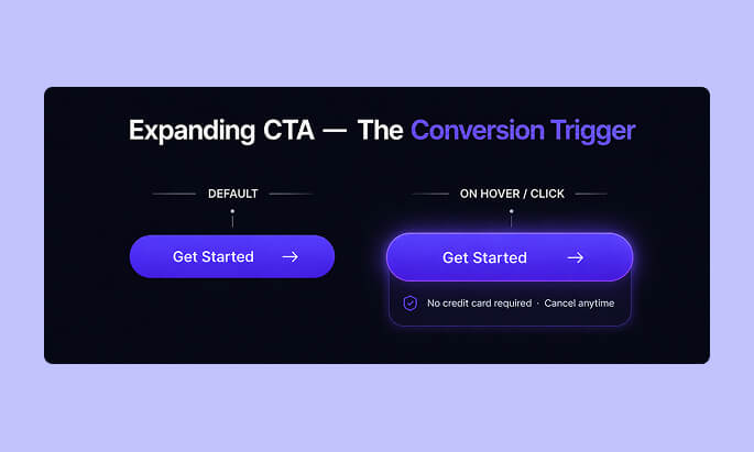
🔵 Expanding CTA
The Expanding CTA module from Divi Essential is one of the most conversion-effective tools in the library. Unlike a standard button, it expands on hover or click to reveal additional context — secondary messaging, microcopy, or supporting detail — before the visitor commits to the action.
Why it works: It creates a two-stage engagement. The initial compact state draws attention; the expanded state delivers persuasive reinforcement. This reduces the psychological commitment of clicking a CTA cold.
Best placement: Above the fold as the primary hero CTA, and midway through long-form pages where momentum needs a boost.
Pro tip: Inside the expanded state, add a short objection-busting line — "No credit card required" or "Cancel anytime" — to eliminate the last micro-friction before conversion.
🔵 Feature List
The Feature List module structures your benefits in a visually scannable format that matches how visitors actually read landing pages — not top-to-bottom, but scanning for relevance.
Why it works: People make conversion decisions quickly. If they can find one point that resonates with their specific need in the first scan, they're far more likely to continue reading.
Best placement: Immediately after your problem/solution block, before testimonials.
Pro tip: Pair each feature list item with an outcome-focused label. Not "Advanced styling options" but "Style every detail to match your brand in seconds."
🔵 Testimonial Slider
The Testimonial Slider brings social proof to life with a dynamic, space-efficient display. Unlike static text blocks, a slider allows multiple testimonials without expanding your page height, keeping the experience tight and focused.
Why it works: Visitors subconsciously use the number and quality of testimonials to assess risk. A slider lets you show volume without visual clutter.
Best placement: After your benefits section and directly before any major CTA.
Pro tip: Include testimonials that specifically address your most common objections. If people worry about setup time, feature a testimonial about how fast it was.
🔵 Comparison List
The Comparison List module is purpose-built for conversion. It presents structured comparisons — your solution versus competitors, or before versus after — in a format that helps visitors make decisions faster.
Why it works: Comparison reduces cognitive load. Instead of visitors having to mentally weigh options, you present the conclusion visually. People are far more likely to act when the decision has already been made for them.
Best placement: In a dedicated "Why choose us?" section, or as part of a pricing section.
Pro tip: Don't be afraid to acknowledge a competitor's strength — then counter with your differentiator. Honest comparisons build more trust than one-sided ones.
🔵 Divi Hotspot
The Divi Hotspot module lets you place interactive annotation points on any image. Visitors hover or click to reveal contextual information about specific features or elements.
Why it works: It transforms a passive product screenshot into an interactive exploration. Visitors spend significantly more time on interactive content, which directly correlates with higher conversion intent.
Best placement: Product demonstration sections, UI walkthroughs, and any scenario where you need to explain a complex visual without surrounding it with dense copy.
🔵 Advanced Tab
The Advanced Tab module organizes dense information — pricing tiers, feature breakdowns, FAQs, or plan comparisons — into a tabbed interface that keeps the page visually clean while making everything accessible.
Why it works: Information overload kills conversions. Tabs let visitors self-select the information most relevant to their situation, which creates a more personalized experience without requiring dynamic content.
Best placement: Pricing sections, product specification areas, and extended FAQ content.
🔵 Data Table
The Data Table module renders clean, readable comparison tables that are especially effective for technical products, SaaS tools, and anything with plan-based pricing.
Why it works: Structured tabular data builds credibility. When visitors see a detailed, well-organized table, they perceive your brand as thorough and trustworthy.
Best placement: Feature comparison sections and pricing pages embedded within landing pages.
Pro tip: Use visual emphasis — row highlighting or column styling — to draw attention to the option you want visitors to choose.
🔵 Lottie
The Lottie module renders lightweight JSON-based animations (created in After Effects or Lottie-compatible tools) directly on your page. Unlike video or GIF, Lottie animations are vector-based, meaning they're crisp at any size and extremely file-size efficient.
Why it works: Motion captures attention, communicates process, and keeps users visually engaged without sacrificing page speed. A well-placed Lottie animation in your hero section can increase time-on-page meaningfully.
Best placement: Hero section supporting graphics, process explanation flows, and feature highlight sections.
🔵 Text Animation
The Text Animation module brings kinetic typography to your landing page — headlines that type on, words that cycle, or text that animates in on scroll.
Why it works: Animated text focuses visitor attention on the message you most want them to read. In a hero headline, it creates a sense of dynamism that communicates modernity and craft.
Best placement: Primary headlines and offer statements.
Pro tip: Animate the high-value words, not filler words. "Build landing pages that convert" is more effective than "Build landing pages that convert."
🔵 Social Share
The Social Share module (called Social Share Button on the website) adds platform-specific sharing buttons with full styling control. For campaign and content-focused landing pages, this adds organic amplification potential.
Why it works for Divi 5 Landing Pages: Every share is a trust signal and a free traffic source. When a visitor shares your landing page or a piece of gated content from it, they're endorsing it to their own audience — an audience that already trusts them.
This social validation loop drives qualified referral traffic with zero ad spend, and the people who arrive via a peer share convert at a significantly higher rate than cold traffic because they arrive pre-validated.
Best placement: Post-conversion confirmation areas, content download pages, or at the end of long-form landing pages with significant value delivery.
🔵 Stripe Button
The Stripe Button module directly integrates Stripe payments into any section of your landing page, enabling one-click purchasing without routing visitors to a separate checkout page.
Why it works: Every additional step in a checkout process loses a percentage of buyers. Bringing the purchase directly to the landing page removes the most common drop-off point in eCommerce flows.
Best placement: Immediately adjacent to pricing, with trust badges and a short value reinforcement statement nearby.
🔵 Time Count Down
The Time Count Down module (called Time CountDown in the plugin) adds a real or session-based countdown timer to any page section.
Why it works: Urgency is one of the most well-documented conversion drivers in marketing psychology. A visible countdown creates a tangible reason to act now rather than later.
Best placement: Hero sections during promotions, pricing sections for limited offers, and sticky bars for time-sensitive campaigns.
Conversion Psychology Principles for Divi 5 Landing Pages

Understanding visitor behavior is just as important as the modules you select for your Divi 5 Landing Pages. These psychological principles should inform every design decision you make on Divi 5 Landing Pages.
Contrast and visual hierarchy: Your CTA must be the most visually dominant interactive element on the page. If it doesn't stand out, it won't get clicked.
Directional cues: Human eyes follow arrows, gaze lines, and diagonal visual flows. Design your sections so the natural eye path leads directly to your CTA.
Friction reduction: Every form field, every step, every decision point is an opportunity for a visitor to abandon. Reduce friction at every stage — fewer fields, clearer labels, one-click where possible.
Loss aversion: People respond more strongly to what they might lose than what they might gain. "Don't miss this" often outperforms "Get this" in CTA copy.
Authority signals: Client logos, media mentions, certifications, and user counts all communicate authority without you having to say "trust us."
Common Mistakes That Hurt Divi 5 Landing Pages

❌ On Divi 5 Landing Pages — using every available module to showcase capability rather than serve conversion goals
❌ No CTA hierarchy — one button buried at the bottom of a long page
❌ Auto-playing, looping animations that distract rather than direct
❌ Generic testimonials without specifics ("Great product!" converts less than "Saved us 8 hours per week")
❌ Not optimizing for mobile — 50%+ of traffic and often the lowest-converting experience
❌ Slow page load times from unoptimized images and too many scripts
❌ No scroll depth tracking — building pages without knowing where visitors drop off
Optimization Strategies for Divi 5 Landing Pages

A/B Testing on Divi 5 Landing Pages: Test one variable at a time — headline copy, CTA color, hero image, page length. Even a 10% lift in conversion rate compounds significantly over time.
Page Speed: Use Divi Essential's lightweight, purpose-built modules rather than heavy all-in-one plugins. Run your page through Google PageSpeed Insights regularly.
Heatmap Analysis: Tools like Hotjar or Microsoft Clarity show you exactly where visitors click, how far they scroll, and where they abandon. This data should drive every major page revision.
Scroll Depth CTAs on Divi 5 Landing Pages: Place a CTA at 25%, 50%, 75%, and 100% scroll depth. Different visitors convert at different points — don't make them scroll back up.
Conversion Tracking for Divi 5 Landing Pages: Connect every CTA to a specific Google Analytics goal or conversion event so you can measure what's actually working.
FAQ: Divi 5 Landing Pages
1. What makes Divi 5 Landing Pages more effective than standard pages?
Well-built Divi 5 Landing Pages are single-purpose, distraction-free, and designed with a clear conversion funnel. They remove navigation and irrelevant content so every element serves the one goal.
2. Which Divi Essential module is best for the hero CTA on Divi 5 Landing Pages?
The Expanding CTA module is purpose-built for hero conversion on Divi 5 Landing Pages. Its expand-on-hover behavior creates engagement and provides space for objection-handling microcopy alongside the main action.
3. Can I accept payments directly on Divi 5 Landing Pages?
Yes. The Stripe Button module from Divi Essential integrates direct Stripe payments into any section, enabling checkout without redirecting visitors to a separate page.
4. How do I add urgency to Divi 5 Landing Pages?
Use the Time Count Down module (available in Divi Essential) to add a countdown timer to your hero section, pricing area, or sticky announcement bar during promotions.
5. What's the ideal keyword density for Divi 5 landing page blog content?
For the focus keyword "Divi 5 Landing Pages," the recommended density is between 1.49% and 2.39% of total word count to balance SEO relevance without keyword stuffing.
6. How many modules should I use on Divi 5 Landing Pages?
On Divi 5 Landing Pages, use only what directly serves conversion. A focused page with 5–7 well-chosen modules outperforms a module-heavy page every time. More is not better — more relevant is better.
Conclusion
Building high-performing Divi 5 Landing Pages is a combination of strategy, psychology, and tool selection. Divi 5 gives you the visual builder. Divi Essential — with its 105+ modules and 22+ extensions, including the Expanding CTA, Feature List, Testimonial Slider, Comparison List, Stripe Button, and Time CountDown — gives you the conversion-specific modules that standard builders simply don't provide.
The difference between Divi 5 Landing Pages that convert at 2% and those that convert at 8% rarely comes down to design aesthetics. It comes down to structure, messaging clarity, module selection, and a relentless focus on removing every barrier between your visitor and the action you want them to take.
Start building your Divi 5 Landing Pages with one clear goal. Choose your modules with intent. Place your CTAs strategically. Test, measure, and improve. That's how Divi 5 Landing Pages go from looking good to performing exceptionally.
🚀 Ready to Build?
Divi Essential is the #1 module pack for Divi 5, trusted by thousands of designers and agencies to build faster, smarter, and at a higher standard.
👉 Explore all 105+ Divi Essential modules 👉 Get started with Divi Essential
0 Comments