How to Create High-Impact Call-to-Actions with the Next Button Module

Ready to transform your website with just one click? Meet the Divi Essential’s Next Button Module—your secret weapon for creating buttons that don’t just look stunning but deliver real results!
Call to Actions or CTA’s is more than a button; it’s a gateway to exceptional user experiences, higher engagement, and skyrocketing conversions.
Imagine a website where every click feels intuitive, navigation flows effortlessly, and visitors are naturally compelled to take action. That’s the magic of a well-crafted Next Button! While Divi users can already create attractive buttons using current modules, the Divi Next Button Module takes it a step further with advanced functionality and customization.
This sleek, functional, and fully customizable tool empowers designers, marketers, and web enthusiasts to elevate their websites from ordinary to extraordinary. Ready to unlock its full potential and create High-Impact Call-to-Actions? Let’s dive into how this tiny yet mighty module can revolutionize your designs!
Why Is Divi Essential’s Next Button Module The Best?
The Divi Next Button Module takes button design to new heights! While the standard Divi button is versatile, this module adds advanced styling, dynamic hover effects, and greater design flexibility.
It’s the perfect tool for creating buttons that align with your brand and enhance user interaction. Whether for call-to-actions, navigation, or interactive elements, this module ensures every click is visually stunning and impactful.
Unique Features of the Divi Next Button Module:
Creative Backgrounds: The module allows you to add unique backgrounds, including images, colors, GIFs, and even videos, helping buttons stand out visually and add relevance to your website’s theme.
Advanced Filters & Blend Modes: With customizable blending options and filters, users can achieve professional and eye-catching effects that enhance the button’s aesthetics and appeal.
Responsive Design: The buttons are highly responsive, ensuring they look and function seamlessly across all devices, including smartphones, tablets, and desktops—a crucial feature for modern websites.
Dynamic Content Integration: This module supports dynamic content, enabling you to link buttons to real-time data or personalized text, reducing design effort while increasing engagement.
Extensive Hover Effects: With over 100 hover effects available, designers can add interactivity and engagement by implementing subtle yet impactful animations that grab users’ attention
Icon Customization: It includes a library of 25+ icons, which can be combined with hover effects, providing opportunities for further customization and enhanced usability.
Animation & Transform Effects: Create unique animations and use transform controls for more dynamic and interactive buttons that align with your website’s tone and user flow.
Premade Button Layouts: The module includes various pre-styled button designs, saving time for designers and offering a foundation for further customizations.
Quick Guide to Create a High-Impact Call-to-Actions Button from Scratch
Add New Page:
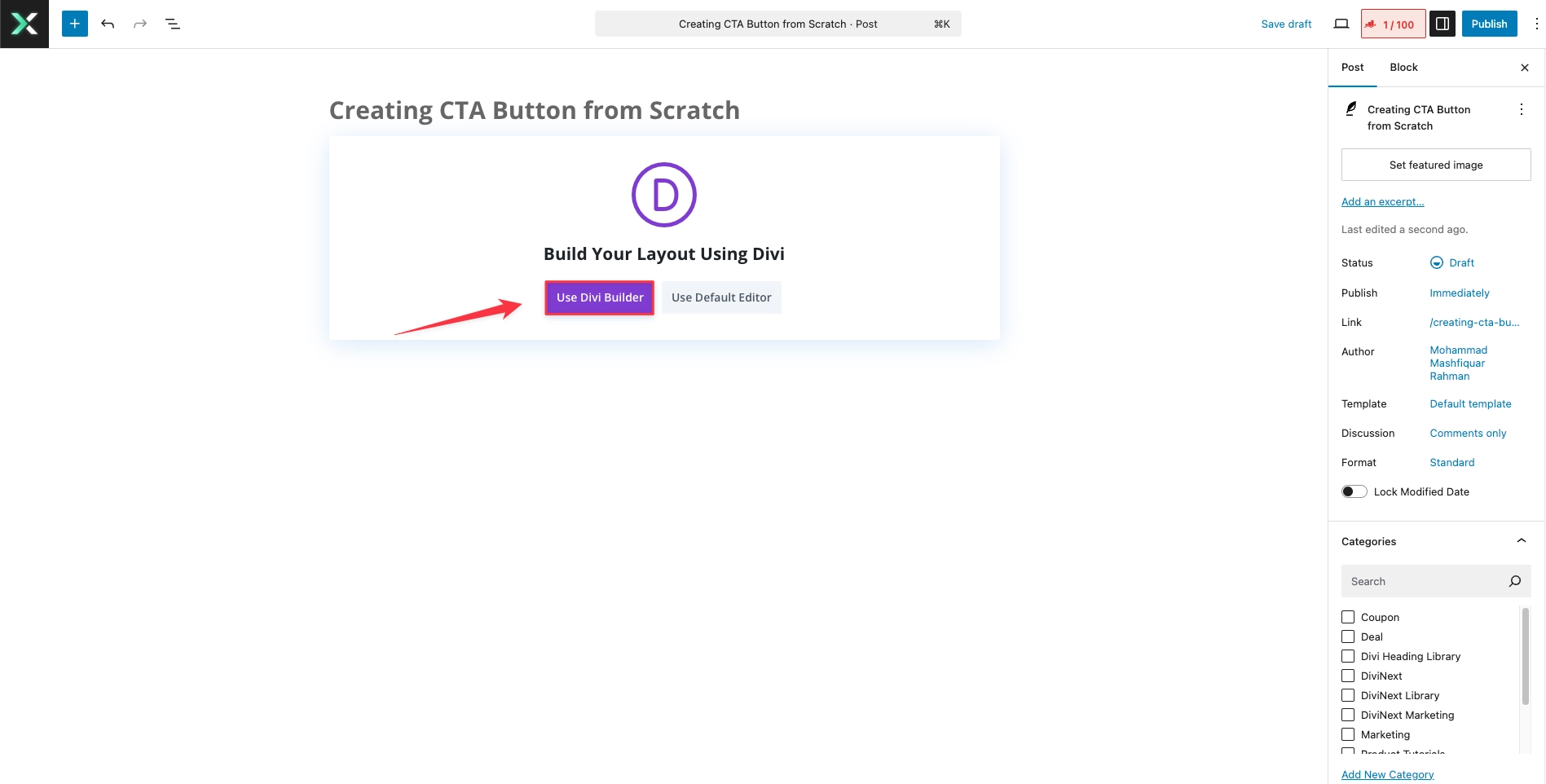
Create a new page, name it and click ‘Use Divi Builder’.

Pick Your Favorite Options:
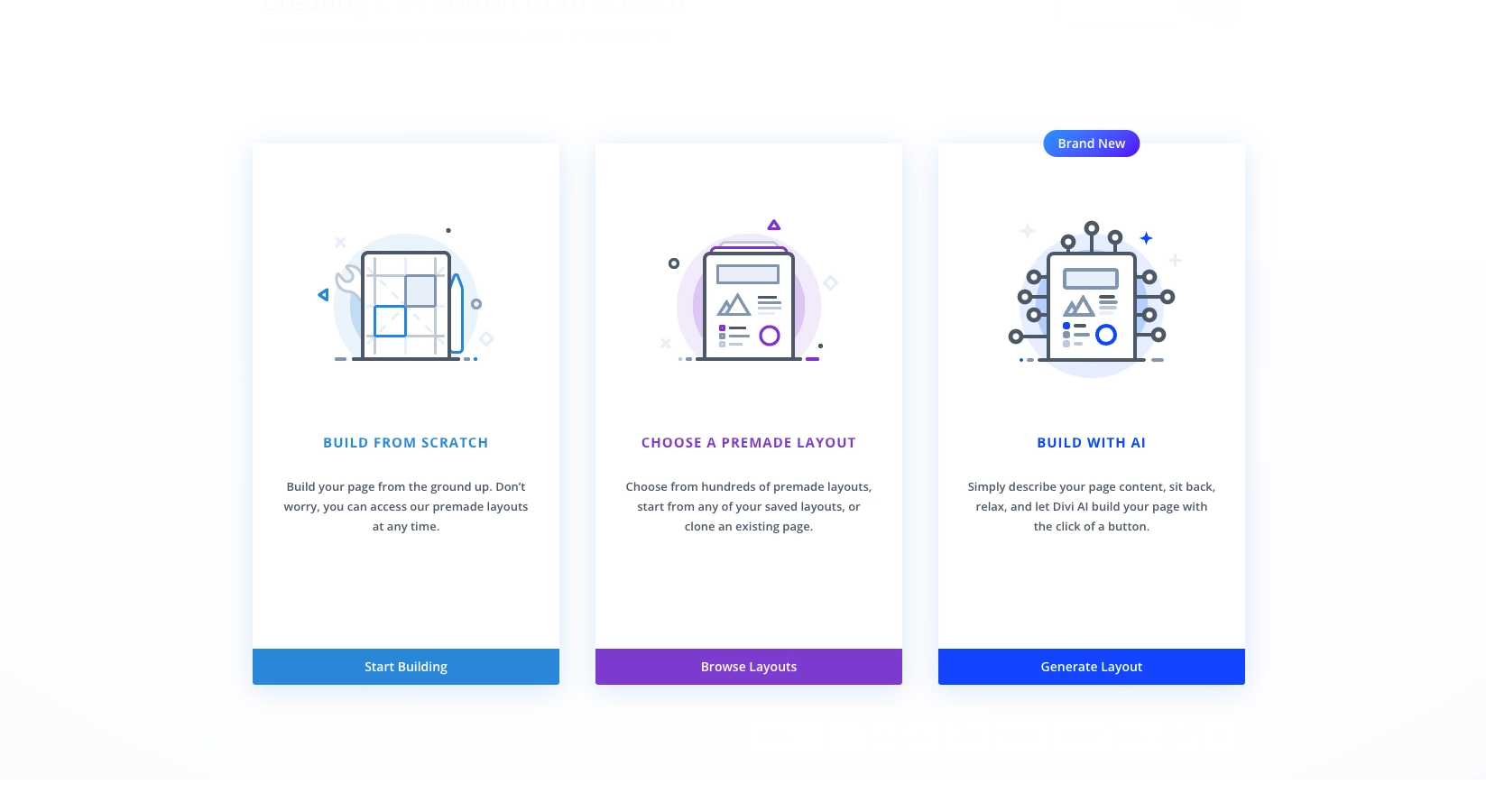
You’ll find three options – Build From Scratch, Choose A Premade Layout, & Build With AI options here. Today, let’s design our Next Button Module from Scratch.

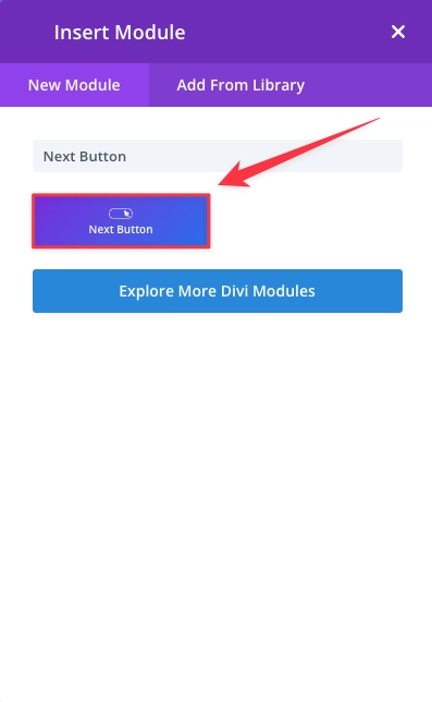
Click the + button inside the row to add a new module.
Search for the Next Button module, then select it.

Customize the Button:
In the Button settings panel, add your button text (e.g., “Learn More” or “Get Started“).
Link: Add the URL to which you want the CTA to direct visitors (e.g., a product page or contact form).
Button Style: Use the Design tab to style your button. You can adjust colors, borders, padding, and more to match your site’s branding.
- Add the Hover effect as per your choice.
- Amazing and mind-gobbling animations are for your use too.
Positioning the Button:
If needed, you can use custom margins and padding within the Design tab to adjust the button’s placement within the section.
Consider adding spacing to ensure it’s easily clickable and visually appealing.
Save & Publish:
Once you’re happy with the button’s design and functionality, click Save in the module, row, and section settings.
Preview the changes to ensure the button works as intended, then Publish your page.
Why Divi Designers Love the Next Button Module?
For Divi designers, the Next Button Module is a lifesaver. Here’s why:
- Time-Saving: Pre-configured hover effects and design elements cut down hours of manual CSS work.
- Improved UX/UI: Engage visitors with interactive, responsive buttons designed to boost conversions.
- Dynamic Branding: Match your button aesthetics to your overall website design effortlessly, whether you’re going for minimalism or bold statements.
- Simplified Navigation: Create directional buttons like “Next” or “Previous” for posts, products, or galleries without extra plugins.
- Custom Code Integration: Add advanced CSS tweaks for unique effects like animated borders, scaling text, or pulsating buttons.
Unlock High-Impact CTAs to Boost Conversions!
Your designs deserve the best! With the Divi Next Button Module, you’re not just adding buttons; you’re creating memorable user experiences that engage, inspire, and convert. Whether you’re enhancing navigation or boosting interactivity, this tool equips you to craft designs that stand out. So, why wait? Start redefining your website with the most effective, High-Impact Call-to-Actions today!
